


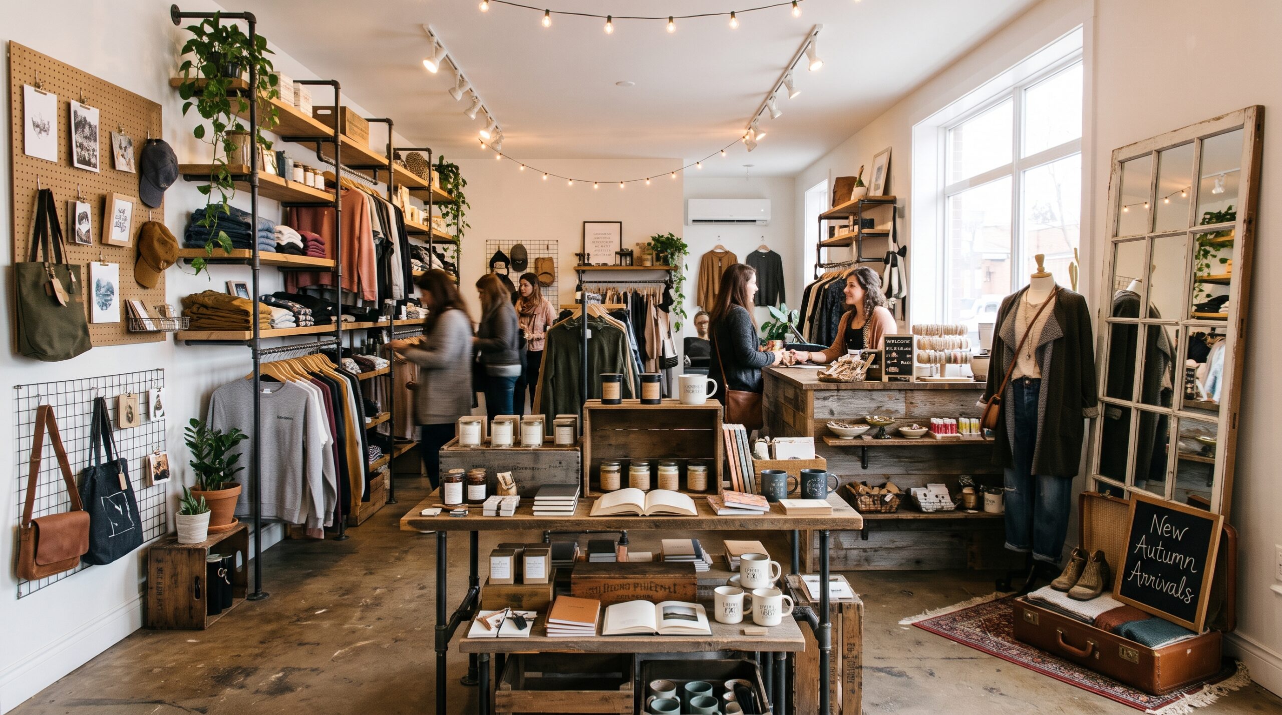
I write product copy for a living. Most of my week, in fact, goes into product descriptions, collection pages, and the little lines of text that convince someone to click “add to cart.” However, some of the most useful visual merchandising ideas I’ve picked up didn’t come from a screen. Instead, they came from standing inside small shops with the owners, watching people walk in, glance around, pick something up, put it back, and leave.
In other words, a physical store is a sales page you can walk through. The window is your headline. Similarly, the first table is your opening paragraph, the shelf sign is your product description, and the checkout counter is your final call to action. Once you see a shop that way, visual merchandising stops feeling like decorating and starts feeling like what it really is: persuasion with objects.
The good news for small retailers is that you don’t need a big chain’s budget to do this well. Although large retailers can pour serious money into visual merchandising, small businesses can still get results on a modest budget. Above all, what you need is a clear plan and the willingness to test.
Below, therefore, are twelve visual merchandising ideas I’d hand to any small shop owner, written from the point of view of someone who obsesses over why people buy.
Why Visual Merchandising Ideas Matter More in a Small Shop
In a large department store, a weak display gets lost in the crowd. By contrast, in a 600-square-foot boutique, every fixture is either doing a job or wasting space. As a result, there’s nowhere to hide.
Small shops also live and die on the first ten seconds. After all, a shopper decides almost immediately whether your store feels like “my kind of place” or “not for me.” Consequently, your layout, your lighting, and the way your products sit on the shelf answer that question before you ever say hello.
Besides that, there’s an ecommerce angle that a lot of shop owners miss. Your customers often browse online first and then walk in expecting the same clarity. So if your website groups products neatly while your shop floor looks like a storage room, that mismatch costs you. It’s a core reason an omnichannel retail strategy matters even for one-store retailers. For this reason, the best visual merchandising ideas borrow from both worlds.
1. Treat Your Window Like a Headline, Not a Catalog
The biggest mistake I see in small shop windows is trying to show everything. Owners want passersby to know they sell candles and mugs and scarves and greeting cards, so they cram it all in. As a result, the window reads like a headline with fifteen words in it, and nobody finishes it.
Instead, a good window makes one promise. First, pick a single theme. Then choose one story and one hero product. Lightspeed’s guide to retail window displays puts it nicely: a window display should work as a teaser, not a full product catalog. In addition, the SBA recommends placing your display’s focal point at the eye level of people walking by.
Match Your Window Visual Merchandising Ideas to the Street
Next, think about who walks past your shop. For example, a store on a busy pedestrian street can afford a subtle, detailed window because people are moving slowly. On the other hand, a shop facing a road needs something bold enough to register from a car. Lightspeed makes this point too, noting that a small store on a busy street surrounded by other shops should approach windows differently than one in an area that isn’t pedestrian friendly. Getting this right is one of the simplest ways to increase foot traffic to your retail store.
Here’s a practical test from my copywriting world. If you can’t describe your window in one short sentence, then it’s doing too much. For instance, “Cozy autumn reading nook” works. Meanwhile, “Some fall stuff, a few new arrivals, and our sale items” doesn’t.
Let the Window Sell After Hours
Finally, small shops often forget that the window works after hours too. The U.S. Small Business Administration has suggested leaving a couple of lights on at night so that someone walking by after closing might be curious enough to come back. Likewise, the same SBA advice points out that big department stores can use backdrops that block the view inside, but a small business can’t afford to. Therefore, your window should invite people to look past it into the shop.
2. Leave the First Few Steps Empty on Purpose
This one feels wrong to most owners, especially when floor space is tight. Nevertheless, the area just inside your door is the worst place to put anything important.
Retail designers call it the decompression zone. According to Aislelabs’ research on customer paths, a good layout keeps an open space of about 5 to 15 feet from the entrance. That’s because people coming in from the street are still adjusting. Their eyes are adapting to the light, they’re finishing a thought, and they’re figuring out where they are. Consequently, anything you put right at the door gets walked past.
Similarly, ShopAppy’s breakdown of store layout science explains this using Paco Underhill’s field research, which found that shoppers entering a store are still adjusting from the sidewalk by slowing down, scanning, and orienting themselves. Accordingly, their advice is to place your first hard-selling display just past that zone, where shoppers have shifted into browsing mode.
Of course, in a small shop you might only have six or eight feet to work with. That’s fine. Simply keep a clean floor, a welcome mat, and maybe a single plant or a simple sign. After that, put your first real display right where the zone ends.
3. Build a Power Wall on the Right
Once shoppers settle in, most of them drift in one direction. In North America and many other markets, that direction is right.
For example, Small Business Trends’ guide to retail floor plans notes that studies suggest around 70% of shoppers instinctively turn right after entering. Furthermore, Aislelabs adds that because most customers turn right, that’s where you should put your power wall with the merchandise you most want seen, and the rest of their path tends to follow a counterclockwise direction.
In short, your power wall is the first full sentence a shopper reads in your store. So fill it with your newest arrivals, your strongest seasonal products, or your highest-margin best sellers. Above all, don’t put clearance here. Clearance tells shoppers “this is what we couldn’t sell,” which is a terrible opening line.
Test Your Visual Merchandising Ideas Before You Commit
Is the right-turn rule universal, though? Not quite. Store shape, door placement, and local habits all matter. Indeed, ShopAppy describes the right-turn bias as a tendency, not a law, and recommends checking it against your own data before committing your floor to it. For that reason, watch your own customers for a week. Where do they go first? Then put your best wall there.
4. Group Products in Threes and Stack Them in Pyramids
Two visual merchandising principles show up in nearly every training manual, and for good reason. They work, and besides, they cost nothing.
To begin with, the rule of three says you should group products in sets of three rather than twos or fours. SnapRetail’s merchandising tactics suggest using three of the same item in different colors, or alternatively three related items. Odd numbers keep the eye moving, whereas even numbers feel static and symmetrical, so the eye stops.
Meanwhile, the pyramid principle handles height. Repsly’s guide to display techniques describes it as a triangular display with the largest item at the center and smaller products toward the outside. As a result, that shape naturally pulls attention up to the peak, which is exactly where your hero product should sit.
Putting Both Visual Merchandising Ideas Together
When you combine the two, you get displays that look intentional instead of thrown together. For instance, a candle shop might show three sizes of the same scent, tallest in the middle on a small riser, with matches and a wick trimmer tucked at the base. Overall, it’s simple, balanced, and easy to shop.
As a copywriter, however, I’d add one thing. Every pyramid needs a reason to exist. For example, a tiny card that says “Our bestselling scent, in every size” gives the display a point of view. Without words, on the other hand, it’s just a nice arrangement.
5. Cross-Merchandise the Way Online Stores Do
Every online shopper knows the “frequently bought together” box. In fact, it’s one of the oldest tricks in ecommerce, and it ranks among the visual merchandising ideas that translate most easily to a shop floor.
The Motley Fool’s guide to merchandising describes cross-merchandising as placing complementary products alongside one another so shoppers pick up add-on items. Likewise, SnapRetail gives a grocery example that sticks in my head: wine displayed next to gourmet cheese, or cookie dough and individual milk bottles sharing an end cap cooler.
For a small shop, cross-merchandising does two jobs. First, it raises the average sale. Second, it helps customers picture the product in their life. For example, a plain linen tablecloth is fine on its own. However, a linen tablecloth laid on a small table with ceramic plates, a bud vase, and folded napkins becomes “the dinner party I want to host.”
Here’s how I’d approach it. To start, look at your sales data and find pairs that already sell together. Then put them side by side and see whether the pairing grows. Additionally, if you run an online store too, check what your platform’s recommendation engine suggests. After all, those pairings are free merchandising research.
6. Write Signs That Sell, Not Signs That Label
This is where my day job really comes in, because most shop signage is a missed opportunity.
The typical shelf sign says “Hand Cream $18.” That’s a label. In other words, it tells me what something is and what it costs, but not why I should care. Compare that with “The one our staff keep in their bags all winter. $18.” Although it’s the same product at the same price, it gives a very different reason to pick it up.
Simple Visual Merchandising Ideas for Shelf Copy
For that reason, I follow a few rules when writing in-store signage:
- First, lead with a benefit or a story, then the price.
- Also, keep it short enough to read while walking. Eight to twelve words is plenty.
- Similarly, write like a friendly staff member, not a legal notice.
- Finally, use the same voice on your signs, website, and social posts.
Some of the best sign lines come straight from customers, so it pays to learn how to get more customer reviews and borrow their words. A short note about who made a product or where it came from also lands well with shoppers drawn to ethical consumerism.
Size and clarity matter too. For example, Pazo’s guide to visual merchandising techniques recommends keeping signage clean and branded, with readable fonts and minimal text to avoid clutter. I’d go a step further, though. If a sign doesn’t add a reason to buy, then cut it. Otherwise, every unnecessary sign makes the necessary ones harder to see.
Don’t Forget the Chalkboard
For instance, a Lightspeed post on retail display tips shared the story of Sparrow & Hawk Apothecary in Jenkintown, Pennsylvania, which used its chalkboard sign to share stats about Amazon and encourage customers to shop small. Even better, the shop doubled the impact by posting a photo of the sign on social media. That’s copywriting doing double duty in the real world.
7. Light the Hero, Not Just the Ceiling
Most small shops are lit like offices, with even overhead light everywhere, no shadows, and no contrast. While it’s practical, it flattens everything. Indeed, when every product is equally bright, nothing stands out.
Fortunately, accent lighting fixes that. A study from lighting company Zumtobel, done with the Royal Institute of Technology in Sweden, found that targeted accent lighting in the lower third of shelves led customers to linger longer and may boost sales. Moreover, a later Zumtobel field study with fashion chain Gerry Weber found that a store with lighting tailored to its target customers achieved up to 10% more turnover than a comparable reference store.
Lighting Visual Merchandising Ideas on a Small Budget
That said, you don’t need a lighting consultant. A few adjustable track heads or clip spotlights aimed at your power wall and window are enough to start. In fact, think of light the way a copywriter thinks of bold text. If you use it sparingly, only on the thing that matters most, it works. If you bold everything, however, it means nothing.
In addition, pay attention to color temperature. Warm light flatters food, wood, textiles, and skin tones. Cooler light, by contrast, suits electronics, tools, and anything that should look crisp and technical. Whatever you choose, though, keep it consistent so the shop feels like one place.
8. Use Color Blocking to Make Small Spaces Feel Organized
Small shops often carry a wide range of products in a tight footprint. Consequently, the risk is visual noise. Color blocking, however, is one of the cheapest visual merchandising ideas for calming it down.
The idea is simple. Instead of mixing every color on a shelf, group products by shade: blues together, then greens, then neutrals. For example, on a rack of shirts, arrange them from light to dark. Similarly, on a wall of notebooks, run them in rainbow order.
From across the room, color-blocked shelves read as deliberate and abundant, even when stock is limited. Up close, moreover, they make browsing faster, since shoppers who want “something green” find it instantly.
Color also sets mood. For instance, a wall of soft pastels feels like spring, whereas deep reds and golds feel like the holidays. Therefore, you can shift the whole feel of your shop just by rearranging which colors are front and center, without buying a single new prop. Reusing what you already own also fits the sustainable shopping trends for 2026 many of your customers care about.
9. Go Vertical When Floor Space Runs Out
When you can’t build out, build up. After all, walls are the most underused real estate in small retail.
For example, Robin Waite’s piece on visual merchandising in small spaces recommends vertical displays, multifunctional furniture, and strategic product placement to make small retail spaces feel larger and more inviting. In particular, floating shelves, pegboard, ladder displays, and hanging fixtures all free up the floor so customers can move comfortably.
However, keep in mind how people actually shop a wall. The prime zone sits roughly between waist and eye level, so that’s where your best sellers and highest-margin products belong. Higher shelves, meanwhile, work well for decorative pieces, visible backstock, or large items that read from a distance. Finally, lower shelves suit heavier items and products that kids or pets might grab.
One caution, though. Vertical doesn’t mean crowded. A tall wall packed edge to edge feels overwhelming. Instead, leave breathing room between groupings so each section reads clearly, just as white space helps a webpage.
10. Make Products Easy to Touch and Try
This is the advantage a physical shop has over any website. People can pick things up, smell them, feel the fabric, and test the weight. In contrast, online stores spend fortunes on product photos and videos trying to fake that feeling. You, on the other hand, get it for free, so use it.
As Zeller’s guide to visual merchandising points out, visual merchandising goes beyond what meets the eye, because sensory branding through sight, sound, touch, smell, and taste creates a deeper retail experience.
Sensory Visual Merchandising Ideas That Invite Touch
In practice, that means a few things:
- First, put testers out and keep them clean and full.
- Next, leave one item unboxed so people can handle it.
- Also, place a mirror near accessories and clothing.
- Then play music that fits your customer, at a volume that still allows conversation.
- Finally, if scent fits your brand, keep it subtle and consistent.
When products are locked behind glass or sealed in packaging, shoppers hesitate. However, when they’re invited to touch, they engage, and engagement eventually leads to buying. So write a little sign that says “Go ahead, try it” and watch what happens.
11. Turn the Checkout Counter Into a Closing Line
Every good sales page ends with a strong call to action and maybe one last offer. Likewise, your checkout counter should do the same.
The counter is where shoppers pause, often for a minute or more while you wrap, bag, and process payment. For this reason, it’s prime time for small, low-cost add-ons. For example, think lip balms, enamel pins, greeting cards, gift wrap upgrades, travel sizes, or a local treat. As a rule, I suggest that anything at the counter should cost less than about a quarter of your average sale, so it’s an easy yes.
Keep the Counter Clean and Branded
At the same time, keep the counter tidy. A cluttered checkout makes the whole shop feel disorganized at the exact moment you want customers feeling good about their purchase, and that last impression is part of how you build customer loyalty. Instead, pick three or four impulse items, rotate them often, and give each one a short line of copy.
Furthermore, your payment hardware is part of the display too. Zeller, for example, notes that its terminals let retailers add branding with custom screensavers and pick a hardware color that fits the store’s design. Ultimately, small details like that make the end of the visit feel as considered as the beginning.
12. Design Displays for the Camera and Your Online Store
Here’s the idea that ties physical retail back to ecommerce. Your displays aren’t just seen by people in the shop. In fact, they get photographed, posted, shared, and reused on your website and social channels.
For instance, Lightspeed lists making sure your displays look good on camera and adding QR codes among its window display tips. Both, in my view, are smart visual merchandising ideas for small shops. A display that photographs well becomes free content, especially as social commerce trends push more discovery onto phones. Similarly, a QR code on a sign can send someone to the product page, a restock alert, or your online store for sizes you don’t carry in person. Just make sure that page loads fast and checks out cleanly, so you don’t lose them to cart abandonment.
Visual Merchandising Ideas That Double as Content
Likewise, Furniture Today described Tuft & Needle’s window in Gilbert, Arizona, where a bed, pillows, side tables, and a wood floor were mounted vertically to the wall so the scene seemed to defy gravity. That kind of display stops people on the street and stops thumbs on a phone screen.
When I plan content with retail clients, therefore, I ask them to photograph every new display the day it goes up, using simple ecommerce product photography tips for clean light and framing. Afterward, those photos feed the homepage banner, the email newsletter, and the social calendar. In other words, one display gives you five uses. That’s the kind of math small businesses need.
How Often Should You Refresh Your Displays?
There’s no single right answer. Even so, stale displays are one of the quickest ways to lose regular customers, which undercuts your customer retention strategies. If someone walks past your window every day and nothing changes for two months, eventually they stop looking.
For that reason, Small Business Trends’ window display guide recommends rotating window displays often so they stay fresh and engaging for repeat visitors. In general, a rhythm that works for many small shops looks like this:
- Window: every two to four weeks, plus key holidays.
- Power wall: monthly, or whenever major new stock arrives.
- Tables and feature displays: every two weeks.
- Checkout add-ons: weekly or biweekly.
In addition, keep a simple calendar. Note what went up, when it went up, and how sales moved. Over a few months, consequently, you’ll learn which visual merchandising ideas actually work for your shop and your customers, which is worth more than any list, including this one.
A Simple Way to Test Your Visual Merchandising Ideas
I spend a lot of time A/B testing headlines online. Similarly, you can run a rough version of the same test in your shop.
First, pick one product and track how many you sell in a normal two-week stretch. Then move it to the power wall, give it accent lighting, and write it a better sign. After that, track the next two weeks. If sales jump, you’ve learned something. If they don’t, however, try a different product or a different message.
Talk to your staff, too. After all, they see things you miss. For example, they know which displays people stop at, which shelves get messy, and which questions customers ask over and over. Those repeated questions, in particular, are usually a sign that your signage needs better copy.
Final Thoughts on Visual Merchandising Ideas
In the end, visual merchandising is selling without speaking. Every table, wall, light, and sign is either helping a customer decide or getting in the way. Fortunately, small shops have a real edge here, because owners can change things quickly, notice what works, and react without waiting for a head office to approve it.
So start with the basics. First, clear your entry. Next, build a strong power wall, group products in threes, and light your heroes. Then add better signs, smarter cross-merchandising, and a checkout that closes the sale. Finally, photograph what you create and let it work online too.
Above all, none of these twelve visual merchandising ideas requires a big budget. Instead, they require attention, a little creativity, and the habit of looking at your shop the way a first-time customer does. If you do that consistently, your store will start selling for you, even when you’re busy behind the counter.
Frequently Asked Questions About Visual Merchandising Ideas
What are the most effective visual merchandising ideas for a small store?
The highest-impact ideas for small shops are a focused window display, a clear decompression zone at the entrance, a strong power wall on the right side, grouping products in threes, and accent lighting on key products. In addition, Aislelabs explains why the entrance zone and right turn matter so much in store layout.
What is the decompression zone in retail?
It’s the open area just inside your entrance where shoppers adjust from the street to the store. For example, Aislelabs recommends keeping roughly 5 to 15 feet of open space from the entrance. Therefore, avoid putting important products there, because shoppers tend to walk past them.
What is the rule of three in visual merchandising?
It means grouping products in sets of three, either the same item in different colors or three related items. As a result, odd-numbered groupings keep the eye moving. Furthermore, SnapRetail covers how to combine it with the pyramid principle.
How often should a small shop change its window display?
Most small retailers refresh windows every two to four weeks, with extra changes around holidays and big product launches. Likewise, Small Business Trends recommends regular rotation to keep repeat visitors interested.
Does lighting really affect retail sales?
Yes. For instance, research by Zumtobel found that targeted accent lighting on shelves encouraged shoppers to linger longer. Moreover, a follow-up field study with Gerry Weber recorded up to 10% more turnover than a comparable store.
How can I connect my in-store visual merchandising ideas to my online store?
First, design displays that photograph well, and then reuse those photos on your website, emails, and social media. In addition, adding QR codes to signage can link shoppers to product pages. Notably, Lightspeed includes both ideas in its window display tips.
References
- Aislelabs. Customer Paths and Retail Store Layout, Part 1
- Aislelabs. Customer Paths and Retail Store Layout, Part 6
- Small Business Trends. Retail Shop Floor Plan Guide
- Small Business Trends. Creative Window Displays: Tips to Captivate Your Customers
- Lightspeed. 16 Tips to Create Retail Window Displays that Dazzle and Drive Foot Traffic
- Furniture Today. Tuft & Needle Arizona Store Presents New Vision of Mattress Shopping
- U.S. Small Business Administration. How to Use Your Store Window Display to Attract Holiday Shoppers
- ShopAppy. Store Layout Science: How Floor Flow Lifts Basket Size
- Dayta AI on Medium. How Store Layout Impacts In-Store Customer Behavior
- SnapRetail. 11 Visual Merchandising Tactics to Increase Sales
- Repsly. Visual Merchandising Display Techniques: 4 Tips to Increase Sales
- The Motley Fool. The Ultimate Small Business Guide to Retail Merchandising Strategies
- Zeller. What Is Visual Merchandising? 8 Tips for Retail Businesses
- Zumtobel. Retail Lighting Study: Attention, Attractiveness and Perception
- Zumtobel. Limbic Lighting Field Study with Gerry Weber
- Robin Waite. How Visual Merchandising Can Make a Big Impact in Small Retail Spaces
- Pazo. Visual Merchandising Techniques
Leave a comment